Although I enjoy working in many different book genres, science fiction has always held a special place in my heart. Maybe it is my early career as a physicist, or maybe just the feeling of unbridled possibility that scifi brings.
And an excuse to use the wonderful Futura typeface with contemporary content, so very appropriate here.
But whatever the underlying reason, in this project I wanted to collect and share early science fiction with a real audience. This commercialized personal project allowed me to bring several 1950’s era (and earlier) time travel science fiction stories together under one cover. And test out my academic-press style typesetting skills. It also was an opportunity to explore Amazon’s self-publishing portals of CreateSpace and KDP.
First Edition
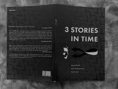
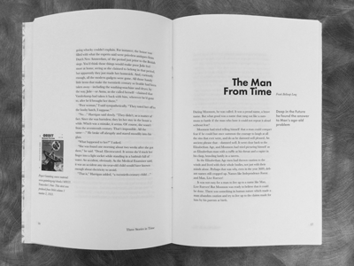
In its first incarnation, an economical 6-3/4 x 10 saddle-stitched book, I combined 3 stories from different sources together, essentially 3 short stories under one cover. I experimented with the layout in this larger page format book, reflecting the original text sizing of pulp fiction books of the time, but offering a far more generous amount of white space on each page.
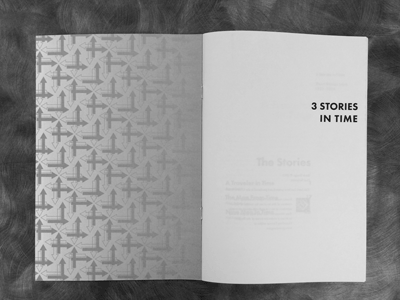
The running header, table of contents, and so on were created to make navigating the book easy and convenient. Wide “classical” margins have been utilized to offer the reader more visual white space to rest on; the extra margins space was utilized for illustrations and notes, allowing the original “paperback” aspect ratio of the text to be utilized.
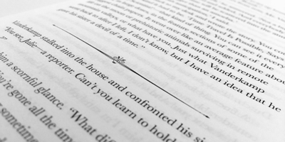
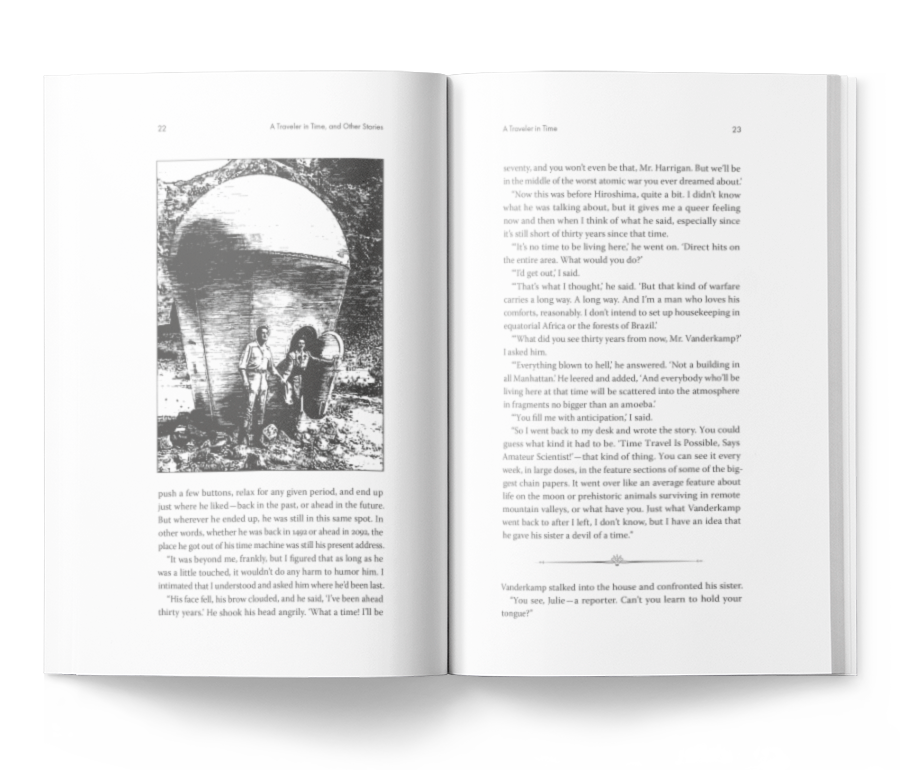
In the interior I’ve utilized original line art when available, as well as other relevant period visual pieces, combined with a “space age” divider line which I created for this publication.
A really fun personal project for me, one that I know succeeded at least at a personal level, because I kept finding myself taking breaks to actually read (and reread) the stories in this format.
Second Edition
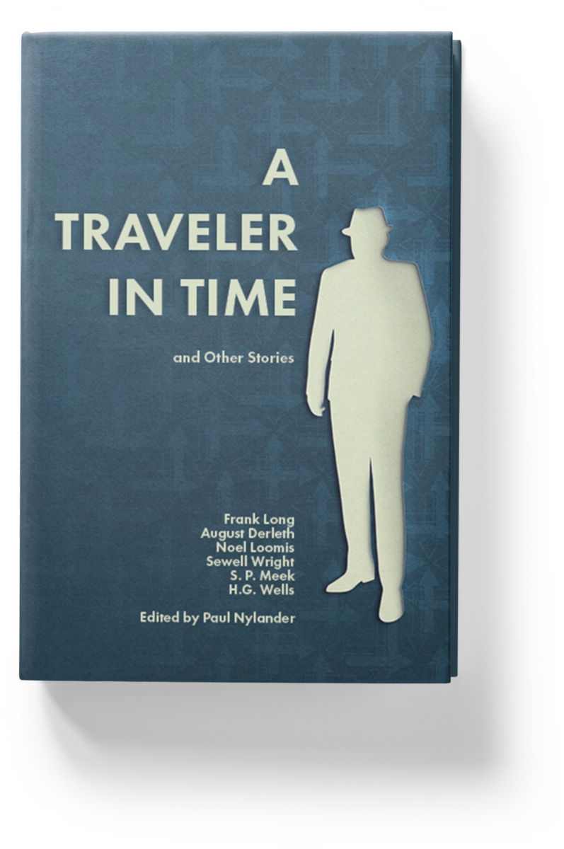
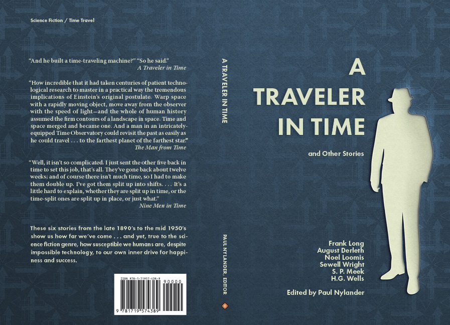
However, I wasn’t satisfied with the original cover. And, in an entirely selfish way, I wanted more of these fun stories to read. So I decided to expand the project to six titles, including the seminal “The Time Machine,” by H. G. Wells, originally published in 1898.
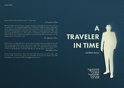
This updated cover concept incorporates a silhouette “cut-out” effect to add visual interest, while still maintaining the original idea of stark clarity.
Second Edition, Revised
Although I argue a book is not like a website, save for a publishing deadline, when is a book every actually done? Like any art form, it really never is. In this case, in the first printing of the second, expanded, edition it was brought to my attention that my typesetting wasn’t exactly academic standard. With each project I do, my standards keep improving, and I knew I wouldn’t be satisfied with Traveler until it was corrected.
In addition to taking the opportunity to reintroduce the “arrows of time” texture to the cover, I reset the entire 200 page text, taking the typographic refinements to the highest possible level.
Details Matter
Do these sorts of details matter, outside of the designer circle? I believe they do, very much so. Even to the untrained eye of an “average” reader, the visual balancing of good typesetting is pleasing; it is comfortable to read, and stays out of the story’s way. Learning to explicitly see what our subconscious mind knows is part of the skills of a good typesetter.
To this end, I cleaned up the layout to produce something fitting for the highest standards of academic publishing, while also choosing a typeface more suitable to the digital printing used for this book. By changing from the Adobe rendition of Baskerville to the more modern (and slightly heavier) Warnock typeface, eye fatigue is reduced through a more even appearance of the text. Page lengths were adjusted, stacked words eliminated wherever possible, and micro-kerning adjustments applied throughout.